How the warmest, most grounding palette of the decade is reshaping Australian interiors — and what it means for your windows.
If you have been scrolling through interior design feeds lately, you have probably noticed something: the cold, stark whites and industrial greys that dominated the last decade are slowly giving way to something warmer, richer, and far more liveable. Cream, sage, terracotta, warm taupe, sandy beige. The warm neutral palette is back in a big way, and it is bringing a sense of calm and comfort that modern homes have been quietly craving.
This is not simply a passing aesthetic mood. It reflects a deeper shift in how people want to feel inside their homes. Spaces that once prioritised visual sharpness are being softened, layered, and grounded. And when it comes to window treatments, one of the largest surfaces of colour and texture in any room, the choices you make can either anchor this palette beautifully or work against it.
This post unpacks the warm neutral trend: what is driving it, the key tones to know, and how to bring it to life through curtains, blinds, and shutters.
Why Warm Neutrals Are Having a Moment
Design trends rarely emerge in isolation. They are almost always a response to the cultural moment we are living through. The rise of warm neutrals is no exception.
After years of prioritising sleek, cool aesthetics, think white subway tiles, polished concrete, and monochrome palettes, many homeowners found their spaces feeling a little cold, a little sterile. Add to that a global shift towards spending more time at home, and the desire for spaces that feel genuinely restorative makes complete sense.
Biophilic design principles, the idea that connecting our interiors to the natural world improves our wellbeing, have also played a significant role. Warm neutrals inherently mimic the tones found in nature: the cream of sea foam, the sage of coastal scrub, the terracotta of sunbaked earth. Bringing these colours inside creates spaces that feel instinctively comforting.
In short: People want their homes to feel like a sanctuary. Warm, nature-inspired tones are one of the most powerful tools available to achieve that.
The Key Tones to Know
Not all neutrals are created equal. Here is a closer look at the standout shades driving this trend:
Cream & Warm White
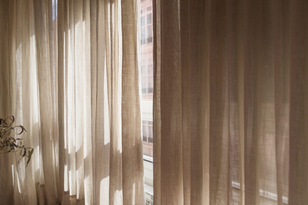
Cream is the sophisticated cousin of plain white. Where cool white can feel clinical, cream brings an inherent softness and warmth. It pairs beautifully with timber, rattan, and aged brass accents, and it works in almost every room of the home. As a window treatment colour, cream curtains and sheers add light and airiness without the starkness of brilliant white.
Sage Green
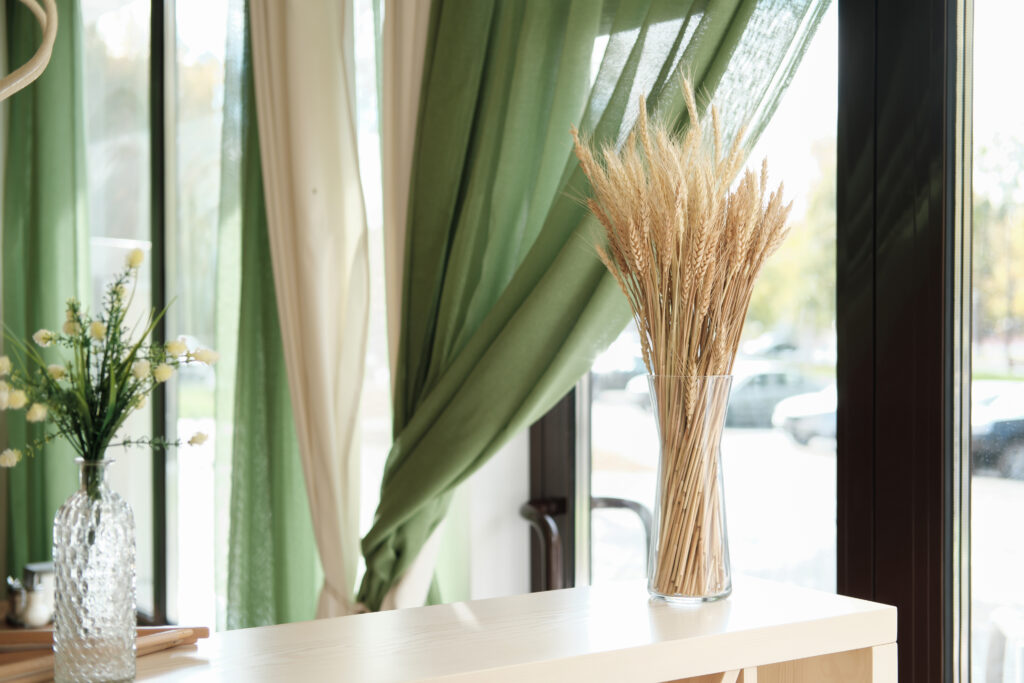
Sage has become the defining colour of this interior design era. It sits perfectly between green and grey, carrying the freshness of a botanical palette without the boldness of a true statement colour. It works beautifully as a wall tone, but increasingly it is being brought into window treatments. Roman blinds, roller blinds, and sheer linen curtains in dusty sage filter light softly through their weave and bring immediate freshness to a room.
Terracotta & Rust
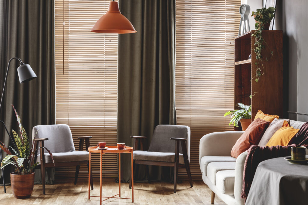
Terracotta adds depth and warmth to any palette. It is a grounding tone that references the earth, and it plays especially well with cream, warm timber, and natural textiles. In window treatments, terracotta works beautifully as an accent: a roman blind in terracotta linen, or a pair of full-length curtains that add a rich, burnished warmth to a living room.
Sandy Beige & Warm Taupe
These are the quiet workhorses of the warm neutral palette. Endlessly versatile, never harsh, and always elegant. Sandy beige and taupe sit comfortably in any space, complementing bolder accents without competing with them. They are particularly well-suited to bedrooms and living areas where a sense of calm is the priority.
Warm Stone & Mushroom
Slightly darker and more complex than beige, warm stone and mushroom tones add sophistication to a space. These tones work particularly well in contemporary homes where warmth is desired but the overall aesthetic remains refined and understated.
Bringing Warm Neutrals to Your Windows
Your windows are one of the most impactful places to introduce or reinforce the warm neutral palette. Here is how different window treatment styles translate this trend:
Curtains & Drapes
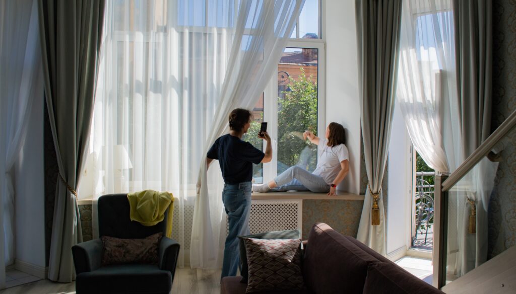
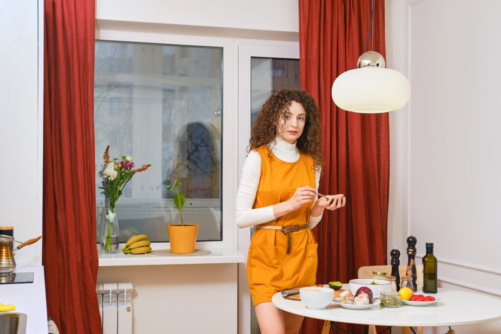
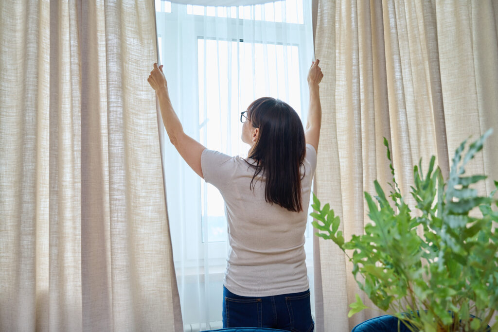
Floor-to-ceiling curtains in linen, cotton, or textured weaves are having a major moment right now, and the warm neutral palette is the perfect vehicle for them. Look for fabrics with natural texture: a slubby linen in warm cream, a cotton weave in soft sage, or a velvet drape in warm taupe for living rooms that need a little more depth.
The key with curtains is generosity. Full, gathered panels that pool slightly on the floor feel luxurious and grounding. This is not a trend for tight, skimpy curtains. Think abundance of fabric, softly filtered light, and texture you can almost feel from across the room.
Roman Blinds
Roman blinds are a natural fit for the warm neutral aesthetic. Their structured folds add visual weight and architectural interest, while fabric choices in linen or cotton in earthy tones bring immediate warmth. Roman blinds in terracotta, sage, or warm beige work beautifully in kitchens and dining rooms where a softer, more decorative window treatment is desired.
Roller Blinds
Do not underestimate the roller blind in this context. A quality roller blind in a warm neutral, a sandy beige screen fabric that filters afternoon light gently or a cream blockout for the bedroom, can be one of the simplest and most effective ways to bring this palette to your windows without overcomplicating the aesthetic. Paired with curtains, it creates a beautifully layered look.
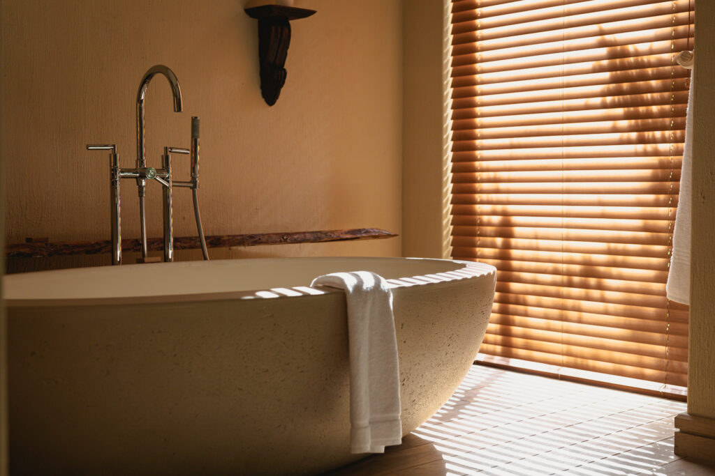
Shutters
Plantation shutters in warm white or cream have become a staple of the warm neutral interior. They bring texture, light control, and a timeless architectural quality that complements the earthy tones in the rest of the space. If you are renovating or building, shutters in a warm off-white finish are a beautiful long-term investment that will sit comfortably across many future iterations of your interior palette.
STYLING TIP: When layering warm neutrals, vary the texture as much as the tone. A cream linen curtain alongside a warm taupe roller blind adds depth without introducing new colours. The contrast comes from the difference in fabric weight and weave.
Pairing Tips: Making the Palette Work
Warm neutrals work beautifully together, but a few guidelines will help you avoid the palette feeling flat or monotone:
- Vary your tones. Use at least two or three distinct shades within the warm neutral family rather than a single colour throughout. Cream walls, taupe blinds, and a terracotta cushion accent, for example.
- Introduce natural materials. Timber, rattan, stone, and terracotta pottery all feel native to this palette. They add organic texture that prevents the look from feeling flat.
- Add one deliberate contrast. A deep navy or charcoal accent in a cushion, artwork, or rug stops the palette from becoming too sweet and adds grounding and sophistication.
- Let natural light do the work. Warm neutrals respond beautifully to natural light, shifting subtly throughout the day. Choose window treatments that allow you to modulate light rather than simply block it out.
- Consider undertones carefully. Not all creams are the same. Some lean pink, some lean yellow. Make sure your fabrics, wall paint, and hard finishes share similar undertones to avoid clashes.
A Note on Longevity
One of the most appealing things about the warm neutral palette is that it is not a flash-in-the-pan trend. Unlike highly saturated statement colours that can feel dated within a few years, these tones have a permanence rooted in their connection to the natural world. Interior designers have been championing warm neutrals for decades. What has changed is that the mainstream has caught up.
Investing in quality curtains, blinds, or shutters in a warm neutral palette is a sound long-term decision. These are colours and tones that will still feel relevant, beautiful, and considered in ten years.
Ready to Bring Warm Neutrals to Your Home?
At Peninsula Curtains & Blinds, we work with homeowners across the Mornington Peninsula to find window treatments that feel right for the way they live. Whether you are drawn to the softness of cream linen curtains, the warmth of a terracotta roman blind, or the quiet elegance of taupe shutters, our team can help you explore the full range of fabric and colour options to bring this palette to life. Visit our showroom or book a free in-home consultation.